 How-to
How to Identify High Quality Screen Printing on T-Shirts
Last Updated: October 22, 2026
Quick Summary
High quality screen printing features crisp, clean edges, vibrant colors that don't fade, and an ink layer that flexes with the fabric without cracking. Check for even color coverage with no thin spots, sharp detail on fine lines and text, and perfect registration on multi-color designs where colors align with no gaps or overlaps.
- Run your finger across the print to feel a distinct ink layer, nearly invisible means too thin, stiff and plasticky means too heavy.
- Stretch the print horizontally, vertically, and diagonally; it should flex with the fabric and recover without white lines or cracks.
- Wash test for at least five cycles in cold water before judging durability, many adhesion problems don't surface until the second or third wash.
- On multi-color designs, check that each color aligns perfectly with no colored halos or visible gaps between layers.
- Inspect at least 10 shirts from different parts of a production run to catch defects that cluster at the beginning, middle, or end.
Table of Contents
- What High Quality Screen Printing Actually Looks Like
- How to Tell If a Shirt Is Screen-Printed or DTG
- Screen Print Registration and Alignment
- Best T-Shirt Fabric for Screen Printing
- How to Test a Screen-Printed Shirt for Durability
- A Buyer's Inspection Checklist for High Quality Screen Printing
- Common Defects and What They Tell You
- Frequently Asked Questions
What High Quality Screen Printing Actually Looks Like
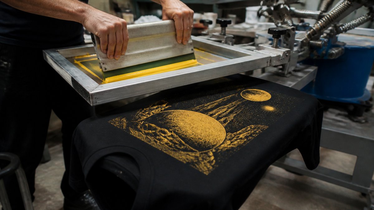
When evaluating a graphic tee, start with how the graphic sits on the fabric. High quality printing means clean edges, vibrant colors, and ink that feels intentional.

A sharp print has crisp edges, even color with no thin spots, and an ink layer that flexes without cracking yet won't fade after a few washes.
Visual signs of a clean, sharp print
Blurry lines, feathering, or ink bleeding are red flags; clean edges mean the print was aligned and ink applied with control.
Check for inconsistency within a single color area. A darker patch in a red graphic means uneven ink coverage, usually inconsistent squeegee pressure or wrong ink viscosity.
Thin lines, small text, and intricate patterns should stay crisp and readable; broken or fuzzy lines point to a worn screen or poor ink-to-fabric contact.
Color vibrancy and even ink coverage
Vibrant colors hold their character and don't look washed out, a properly printed graphic should look as bold on the shirt as in the design file.
Run a finger across the print: you should feel a distinct ink layer.
Check the print under different lighting. A quality print holds consistent color indoors and in sunlight; dull or inconsistent color can signal low-quality inks or incomplete curing.
How to Tell If a Shirt Is Screen-Printed or DTG
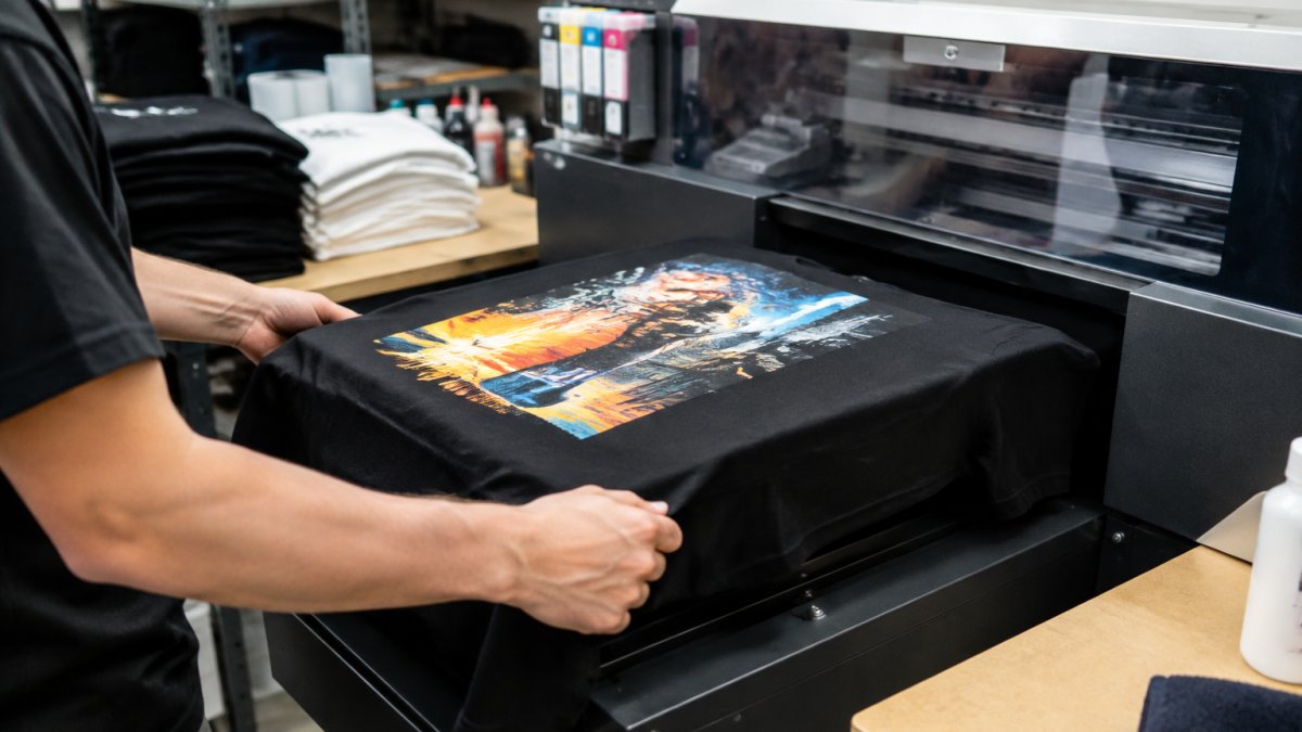
To tell them apart, run your hand across the print. DTG prints feel closer to the surface, absorbed into the fibers.
Look at the back of the shirt. DTG typically shows minimal ink transfer, if any.
Under magnification, DTG edges may feather slightly as ink diffuses into fibers.
DTG handles complex multi-color designs efficiently and works well on lighter garments.
Screen Print Registration and Alignment
Registration is how precisely each color layer aligns with the others, in a multi-color design, every color application must sit in exactly the right position.
Misalignment shows up as colored halos or visible gaps; even a quarter-inch becomes obvious on a finished shirt.
Single-color prints don't have registration issues, but anything with two or more colors needs tight registration for a professional appearance.
Best T-Shirt Fabric for Screen Printing
Fabric choice affects how a print looks, feels, and ages, but there's no single "best" shirt, the right blank depends on the design, ink system, and how it will be worn. Learn how weight, fiber content, weave, and color interact with ink so you can judge whether a print was set up for success.
Fabric weight: a trade-off, not a ranking
Fabric weight is measured in ounces per square yard (oz) or grams per square meter (GSM). A 5.3 oz (roughly 180 GSM) ring-spun tee and a 7.5 oz (245-255 GSM) heavyweight behave differently under a print, but neither is automatically higher quality.
- Lighter fabrics (roughly 4.5-5.5 oz): Ink can strike through more easily, so printers often use thinner deposits or higher mesh counts. Edges may look softer, and large solid areas can show fabric texture. These drape well and suit detailed, multi-color work where a soft hand matters.
- Mid-weight fabrics (roughly 5.5-6.5 oz): A common compromise, enough body to hold a clean edge without feeling stiff.
- Heavyweight fabrics (roughly 7 oz and up): More surface stability, which helps registration and bold solid shapes. The trade-off: heavy fabric plus heavy ink can feel boardy, especially on large panels.
A 7.5 oz (245-255 GSM) cotton tee gives a stable print surface, but it isn't inherently better than a well-printed 5.3 oz shirt. Judge the print in front of you, not the weight number alone.
Fiber content and ink compatibility
100% cotton is the most predictable surface for printing because fibers accept ink consistently and tolerate curing heat. Blends change the equation:
- Cotton/polyester blends can be printed, but polyester dyes may migrate into ink over time (dye migration), especially on dark colors. Printers manage this with barrier base layers or lower curing temperatures.
- Tri-blends (cotton/polyester/rayon) have a softer hand but can show more texture through the ink and may require test prints to confirm adhesion.
- 100% polyester performance shirts usually need dye-migration-resistant inks and careful heat control.
If a shirt is a blend, ask the printer what ink system and cure schedule they used, a clean print on a blend is possible, but not without the right ink.
Graphic Tee — Geometric Emblem Back Print with Minimal Front Logo →
Weave and surface texture
A tight, smooth knit gives uniform contact for sharp edges and even coverage. Looser knits, slubs, and heavy heather textures create peaks and valleys where ink pools or thins, so expect slightly softer edges even on a well-executed print, a fabric characteristic, not a defect.
Light vs. dark garments
The same design rarely prints identically on white and black shirts:
- Light garments often need a thinner ink deposit because the shirt color already provides contrast. Printers may skip an underbase, keeping the hand softer.
- Dark garments usually require a white underbase to make colors pop. That underbase adds thickness and can stiffen the print. A well-cured underbase should still flex without cracking; a poorly cured one is where cracking often starts.
- Dark garments can also reveal registration errors, a white underbase peeking out at the edge of a color layer is a classic sign of misregistration on black shirts.
When you compare two shirts, compare like with like. A print on a black heavyweight tee and a print on a white lightweight tee are not a fair side-by-side.
How to Test a Screen-Printed Shirt for Durability
Most durability advice stops at "stretch it and wash it," which doesn't tell you what counts as a pass. The method below turns durability into something you can score, compare across shirts, and use to evaluate a bulk order before accepting delivery.
Stretch test with measurable criteria
- Sample the print, not the shirt. Pick three points: a solid color block, a fine detail area, and an edge where ink meets bare fabric.
- Stretch horizontally, vertically, and diagonally at each point until the fabric is taut but not distorted.
- Hold for two seconds, release, and inspect.
What to record:
- Pass: The print flexes with the fabric, returns to shape within a few seconds, and shows no white lines, cracks, or lifted edges at any of the three points.
- Marginal: The print recovers but shows faint lightening along stretch lines that fades after a minute. Note it and re-check after washing.
- Fail: Visible cracks, persistent white stress lines, or lifted edges. Any fail at any of the three points is a fail for that shirt.
Run the same test on at least three shirts from different parts of a production run. A single pass tells you one shirt is fine; three passes tell you the run is consistent.
Wash test with a scoring rubric
Use a consistent protocol so results are comparable:
- Wash in cold water (around 60-80°F) with a mild detergent and similar colors.
- Tumble dry low or line dry.
- Repeat for three cycles before final inspection, then a fifth cycle for a longer read.
Score each shirt after cycles 1, 3, and 5:
| Check | Pass | Marginal | Fail |
|---|---|---|---|
| Color retention | No visible shift from the original | Slight dulling, still recognizable | Noticeable fade or hue change |
| Cracking | None | Hairline cracks under close inspection | Visible cracks across the design |
| Edge integrity | Edges intact | Slight softening at edges | Lifting, flaking, or peeling |
| Adhesion | Fully bonded | One or two tiny lifted specks | Any flaking or peeling |
| Hand feel | Similar to pre-wash | Slightly stiffer or softer | Noticeably stiff, rough, or tacky |
A shirt that passes all five checks after five cycles is a strong durability signal. A shirt that fails any check at cycle 1 or 3 is a red flag regardless of how it looks new.
Bulk order inspection: sampling and defect rates
A single sample proves the printer can produce one good shirt; a bulk order requires a different method:
- Pull shirts from the beginning, middle, and end of the run. Defects often cluster, ink that thickens as the session goes on, shows up in the last shirts printed.
- Inspect a fixed sample size. For a run of 50-100 shirts, inspect at least 10. For larger runs, inspect roughly 10% or a minimum of 15 shirts, whichever is greater.
- Score each shirt against the checklist (edge sharpness, color evenness, registration, adhesion, wash result).
- Calculate a defect rate. Count shirts with any fail-level issue and divide by the number inspected. A common acceptance threshold is under 5% fail-level defects; anything higher warrants a conversation with the printer before accepting.
- Document with photos and shirt IDs. Photograph each defect next to a label or tag so the printer can trace it to a specific press run or ink batch.
What to send back to the printer
A useful defect report includes the defect type, how many shirts were affected, where in the run they came from, and photos. Printers can act on that; "the print looks bad" can't be acted on. When comparing printers, run the same protocol on each sample.
A Buyer's Inspection Checklist for High Quality Screen Printing
Use this checklist when assessing a sample or inspecting a bulk order.
| Inspection Point | What to Look For | Pass/Fail |
|---|---|---|
| Edge sharpness | Crisp, clean lines with no feathering or bleeding | |
| Color evenness | Uniform color across the entire design with no thin spots | |
| Ink coverage | Visible, substantial ink layer that feels distinct to the touch | |
| Registration (multi-color) | Perfect alignment between colors with no gaps or overlaps | |
| Ink flexibility | Print flexes with fabric and recovers without cracking | |
| Tactile quality | Raised ink layer that's smooth, not rough or sticky | |
| Wash durability | No significant fading or color shift after multiple wash cycles | |
| Adhesion | No flaking, peeling, or lifting at edges after washing | |
| Back of shirt | Minimal ink transfer to back | |
| Design detail | Fine lines and small text remain crisp and readable |
Use it consistently across inspections to catch quality issues before they become problems.
Common Defects and What They Tell You
Knowing what causes defects helps you tell isolated accidents from systemic quality problems.
Color shift or fading after washing usually means inks weren't colorfast or the curing temperature was too low.
Ink peeling or flaking indicates poor ink-to-fabric adhesion, caused by incorrect pretreatment, a mismatched ink type, or incomplete curing.
Each defect tells a story about where the process broke down.
Identifying high quality printing comes down to knowing what to look for and testing before you commit.
Frequently Asked Questions
How can you tell if a screen print will crack or peel?
Look for signs of improper ink curing and poor adhesion. Gently flex the printed area, if the ink cracks or shows white lines through the design, curing was incomplete. Check the edges: crisp, well-adhered ink stays smooth, while poorly cured prints flake or peel at the edges. Wash a test garment in cold water; high quality screen printing holds color and integrity through multiple washes, while weak adhesion causes fading, cracking, or peeling within the first few cycles.
What should a high quality screen print look and feel like?
High quality screen printing feels smooth and flexible, not stiff or plasticky. The ink sits evenly across the design with no bare spots or thin areas. Edges are crisp and clean, not fuzzy or bleeding into the fabric. The print has a slight texture you can feel, but it flexes with the fabric without cracking. Colors appear vibrant and consistent, with no color registration issues where different colors meet. The overall hand feel, how soft and natural the shirt feels, should remain comfortable, not compromise the fabric's drape.
Does a thicker T-shirt always mean a better screen print?
No. Fabric weight (measured in GSM or ounces) affects durability and print longevity, but thickness alone doesn't guarantee quality. A 7.5 oz (245-255 GSM) heavyweight cotton provides a strong, smooth surface for crisp print detail and good ink adhesion. However, a well-printed 5 oz shirt can outlast a poorly printed 10 oz shirt. What matters most is proper ink curing, even application, and the fabric's fiber quality. Heavyweight fabric simply gives you a better foundation for holding print detail and resisting wear.
How do you check whether a screen print is aligned correctly?
Print registration, the alignment of multiple colors, should be consistent across the design. Look where different colored inks meet: the lines should be sharp and clean, not overlapping or gapped. Check symmetry: if the design has a center point or repeated elements, they should line up evenly. Examine multi-color prints for color bleeding or shifting at the edges. Place the shirt flat and compare the front and back prints to the same reference point on the garment. Misalignment indicates rushed production or worn screens, both signs of lower quality control.