 How-to
How to Design an Original Graphic Tee?
Table of Contents
- Why Originality Matters in Graphic Tee Design
- Finding Inspiration Without Copying
- A Practical Originality Audit and Similarity Check
- Choosing a Base Garment for Print Clarity
- Step-by-Step: From Concept to Print-Ready Artwork
- Placement, Layout, and Visual Hierarchy
- Testing Your Design Before Selling Business Merch
- Start Your Next Original Piece With AW3SOME
- Frequently Asked Questions
How to Design an Original Graphic Tee
Last Updated: November 12, 2026
At AW3SOME CLOTHES INC, we design graphic tees that are never reprinted, so originality is the starting point for everything we make. Designing an original graphic tee means building a concept that is yours, checking it against what already exists, and preparing it so it prints cleanly on a heavyweight blank. This guide walks through each step, from first idea to print-ready file.
Why Originality Matters in Graphic Tee Design
An original graphic tee is one whose artwork, concept and composition come from you rather than from a trend or another designer's work. Originality matters because shoppers can tell the difference between a tee with a story and a tee that looks like everything else on the rack.
Original design also protects your time and money. A concept built from scratch is easier to defend, easier to brand and less likely to be taken down or copied.
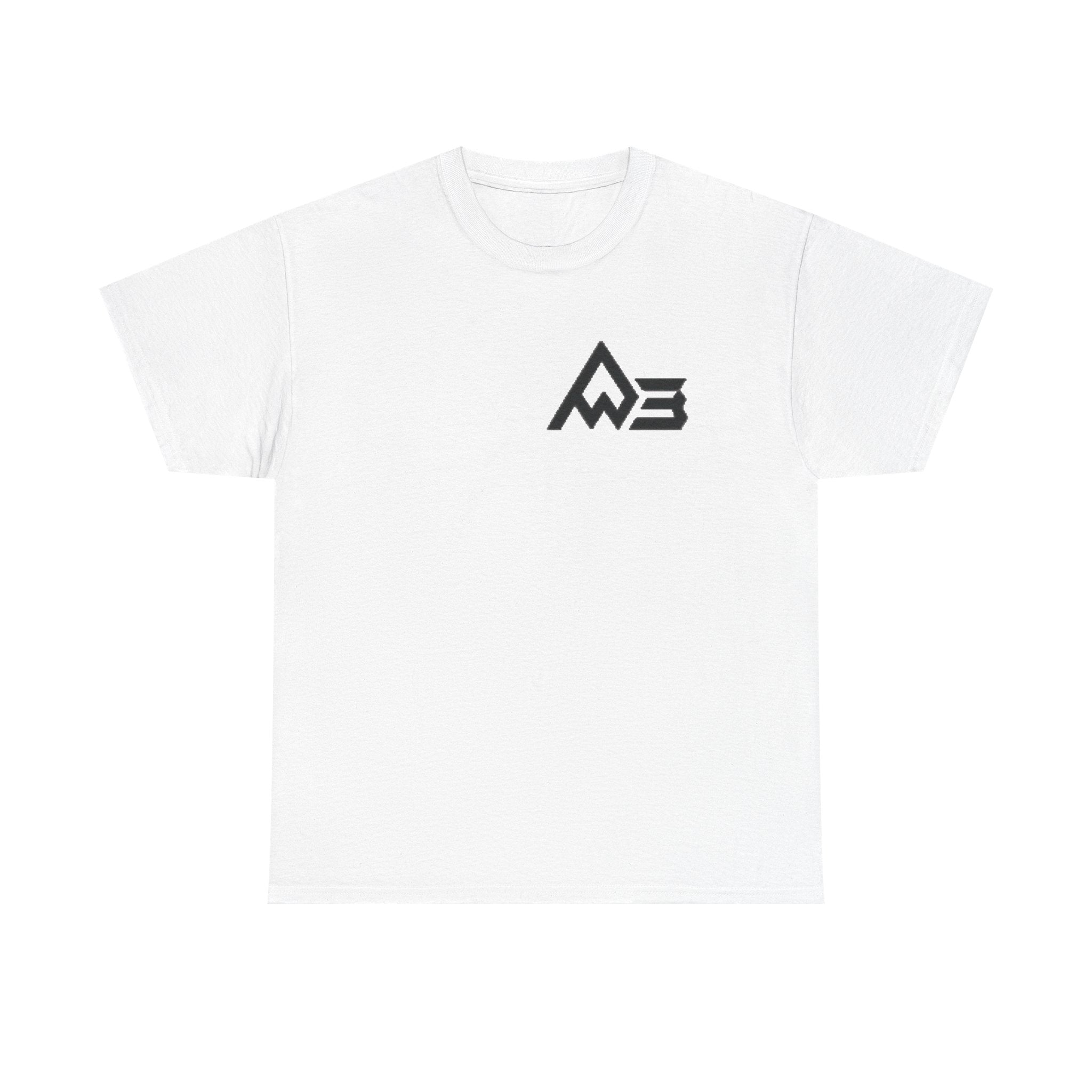
This guide from AW3SOME CLOTHES INC covers how to get there: find inspiration without copying, check your work for similarity, pick a base garment that shows your print well, and test the design before you sell it. You can see how we approach this in our own graphic tee with an emblem on the back, which shows how a bold, minimal design plays out on a real garment.
Finding Inspiration Without Copying
Inspiration is the raw material of design. Copying is taking the finished result of someone else's work. The line between them is not a feeling, it is a set of concrete transformations you can name, document, and defend.
A useful way to think about it: inspiration gives you a direction (a mood, a palette family, a compositional principle, a theme), while copying reproduces the specific expression of someone else's idea. Copyright protects expression, not ideas.
The four-axis transformation test. When you pull from a reference, change it on at least three of these four axes before you call the result yours:
- Concept. Shift the underlying idea, not just the surface. If the reference is "a skull made of flowers," your version might be "a circuit board made of wildflowers", same visual grammar, different concept.
- Composition. Change placement, scale, framing, and negative space. A centered symmetrical mark and an off-center asymmetric one read as different designs even when they share a subject.
- Wording. If the reference uses a slogan or phrase, write your own. Do not paraphrase a protected slogan, a close paraphrase can still infringe. Start from your own message and build the type around it.
- Visual treatment. Change the medium, line weight, texture, palette, or rendering style. A flat vector treatment and a halftone photographic treatment of the same subject are distinct expressions.
If you can only change one axis, you are too close. If you can change three or four, you have transformed the reference into a new work.
Where the legal lines actually sit. You do not need to be a lawyer to avoid the most common mistakes, but you do need to know which rights apply.
- Copyright covers original artwork, illustrations, photographs, and written text fixed in a tangible form. It attaches automatically when a work is created, there is no registration requirement to hold it, though registration affects what remedies are available in the U.S. Do not reproduce, trace, or closely imitate a copyrighted illustration, photograph, or character.
- Trademark covers brand names, logos, slogans, and symbols used to identify the source of goods. Trademark rights can exist even for a phrase that feels generic, and they are registered by class of goods, a slogan registered for beverages may not block a tee, but a slogan registered for apparel will. Search the U.S. Patent and Trademark Office database before you build a design around a phrase you intend to use as a brand.
- Licensing governs assets you did not create: fonts, stock illustrations, photographs, and AI-generated imagery. Read the license for commercial apparel use specifically, not just "commercial use." Many free font and stock licenses exclude merchandise or require an extended license.
- Fan art and characters sit in a gray zone that is grayer than most creators assume. A recognizable character, logo, or team mark is almost always protected, and "I drew it myself" does not change that. Treat fan art as a personal-use project unless you have a license.
A practical reference log. Keep a simple document for every design: the references you pulled, what you took from each (a color, a compositional principle, a mood), and which of the four axes you changed. This log does two things. It forces you to be honest about how much you borrowed, and it gives you a written record of your process if a question ever comes up.
Watch out: "I changed the colors" is not transformation. Recoloring a traced or closely imitated illustration is still a derivative work, and it is one of the most common ways small brands get into trouble.
The references are inputs, not templates. The output should be something you could not have found by searching.
A Practical Originality Audit and Similarity Check
Most guides tell you to "search before you print." That is not a process. A real originality audit is a repeatable workflow you can run in under an hour, document, and revisit if a design is challenged later.
Run the audit in four passes. Do them in order, because each pass narrows the next.
Pass 1, Concept search. Write your core concept in three different phrasings (for example, "desert sunset line art," "minimal southwest horizon," "warm gradient landscape tee"). Search each phrase on image search, on print-on-demand marketplaces, and on at least one general web search. Save the top 20 results per phrase into a single folder. You are looking for two things: exact matches to your concept, and clusters of near-identical treatments that suggest the concept is saturated.
Pass 2, Composition comparison. Subject matter is only half of similarity. Two tees can share a subject and still be distinct if the layout, scale, and framing differ.
Pass 3, Element and rights check. List every discrete element in your design: typefaces, slogans, characters, symbols, patterns, photographic assets, and any AI-generated imagery.
Pass 4, Document and revise. Keep an audit log: the search phrases you used, the closest matches you found, the axes on which your design differs, and the license or source for every asset.
Watch out: a clean image search does not mean you are clear. Image search does not index every marketplace listing, every small brand's catalog, or every registered trademark.
A similarity check does not replace advice from a qualified intellectual property attorney, especially if you plan to build a brand around a name, slogan, or recurring character.
Choosing a Base Garment for Print Clarity
The blank you print on shapes how your artwork reads. A heavier fabric holds a crisp outline, while a thinner fabric can make fine detail look soft.
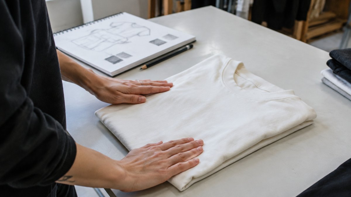
Our tees use the Shaka Wear SHMHSS Unisex Max Heavyweight Short Sleeve at 7.5 oz (245-255 GSM). The relaxed fit gives your artwork room, and the shoulder-to-shoulder neck tape and double-needle stitching help the shirt hold its shape. Heavier fabric does not automatically mean better, but for bold graphics it gives a solid base to print on. You can also compare options in our guide to premium heavyweight t-shirts for men.
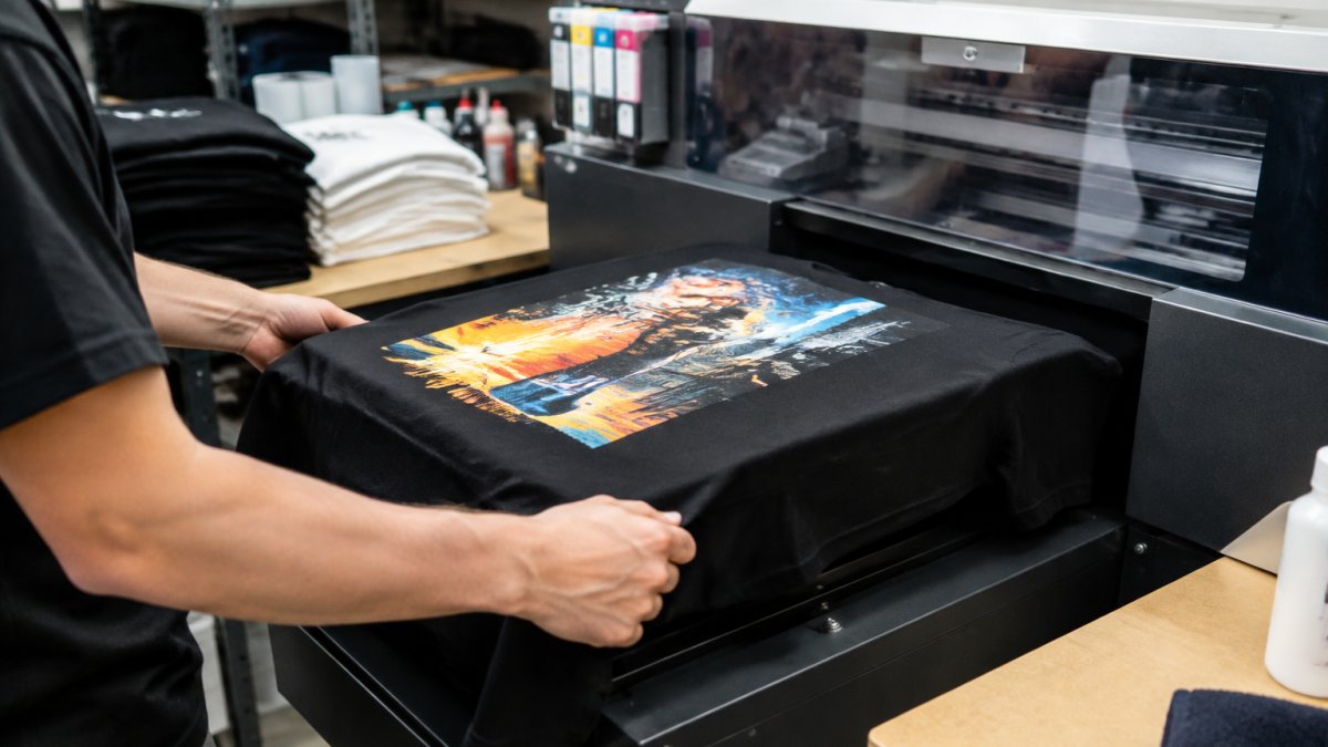
Our graphics use DTG (direct-to-garment) printing. DTG works well for detailed artwork and gradients. Check how your design will look on the color you choose, since a dark shirt changes how bright inks appear.
Our standard colors include:
- Standard colors of 100% USA cotton for the cleanest print on most designs
- Heather Grey at 90/10 cotton/poly for a softer, mixed tone
- Charcoal Grey at 50/50 for a darker, muted base
Pick the blank before you finalize the artwork, because the color affects contrast, line weight and how much detail survives in your graphic tee design. For guidance on picking the right fit for a heavyweight tee, see how to choose the right fit for heavyweight streetwear tees.
The table below summarises the three standard tee colours and their fabric blends, as described in this section.
| Colour | Fabric | Best for |
|---|---|---|
| Standard colours | 100% USA cotton | Cleanest print on most designs |
| Heather Grey | 90/10 cotton/poly | Softer, mixed tone |
| Charcoal Grey | 50/50 cotton/poly | Darker, muted base |
Step-by-Step: From Concept to Print-Ready Artwork
This process takes you from a rough idea to a file a printer can use.
- Define the message. Write one sentence describing what the tee should say or feel like.
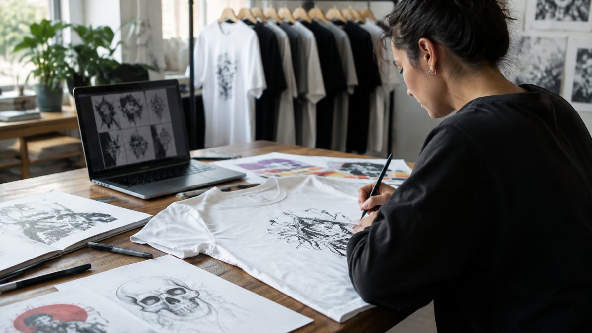
- Sketch three concepts. Keep them rough and quick. Pick the strongest.
- Run the originality audit from the section above.
- Choose your base color and check contrast against your main ink colors.
- Build the artwork at the final print size, in a vector format where possible so edges stay sharp.
- Export a print-ready file with a transparent background and a resolution high enough for the print area.
- Mock it up on the actual blank and check the scale.
Working at the final print size from the start prevents surprises. A detail that looks fine on a laptop can disappear on a shirt.
Placement, Layout, and Visual Hierarchy
Placement decides where the eye goes first. A large back print reads from across the room, while a small chest logo is a quiet signal up close. Both can work, but they do different jobs.
Visual hierarchy means the most important element is the easiest to see. Use size, contrast and spacing to lead the eye from the main graphic to the secondary details. Leave breathing room around the edges so the design does not feel crowded on the body.
Balance matters too. A heavy graphic on one side of the chest can look lopsided. Center the main art, or offset it deliberately, and check the mockup from a few feet away.
Testing Your Design Before Selling Business Merch
If you plan to sell tees or make them as business merch, test before you commit to a full run.
Order a single sample and wash it according to the care label. Care instructions vary by product, so follow the care label on the garment you buy. Check whether the print still looks sharp after several washes. A design that fades or cracks early is a sign to adjust the ink density or the file.
Show the sample to a few people in your target audience and ask what they see first. Their answers reveal whether the concept is clear and whether it feels original to them.
Keep your design files organized so you can reprint or adjust without starting over. For care guidance on screen-printed and DTG shirts, see ironing screen-printed shirts safely step by step.
Start Your Next Original Piece With AW3SOME
Designing an original graphic tee takes a clear concept, honest research, a well-chosen blank and a test before you sell. Work through the audit, pick a base that suits your artwork, and check the mockup at real size.
If you want to see originality in practice, explore our latest drops and the design thinking behind them. Shop the latest drop at AW3SOME CLOTHES INC and see how a bold, original concept looks on a heavyweight tee.
Frequently Asked Questions
Can you provide a guide for designing a T-shirt?
Start with a clear concept, check it against existing artwork, pick a base garment, and build a layout with a simple hierarchy. Then export a print-ready file at the print size you need. Each step should be finished before you move on, so that problems such as similarity or poor contrast are caught early rather than after printing.
How do I check whether a T-shirt design is too similar to existing artwork?
Run reverse image searches, search marketplaces and social platforms using the design's key words and motifs, and compare your sketch side by side with the closest matches. If the composition, specific illustration or lettering closely mirrors another artist's work, rework it. Keep notes on what you checked so you can show your process if questions come up later.
What are some simple graphic tee design ideas?
Simple approaches include a single bold icon with one line of type, a geometric emblem on the back with a small chest logo, or a monochrome illustration with generous negative space. These work well because they rely on strong shape and balance rather than detail, which keeps the design readable from a distance and easier to reproduce cleanly.
How do I turn a T-shirt design idea into a print-ready file?
Create the artwork at the final print size in a vector or high-resolution raster format, use a transparent background, and keep the colors limited and clearly defined. Confirm the print area with your printer, check that lines and small type remain legible at actual size, and save the file in the format the printer requests.